The Traveller’s Guide to Sacred Scotland
We’re pleased to be able to tell you about the new book from our friend Marianna Lines. An authority on ancient sites, especially in Scotland where she lives, Marianna is also a talented artist. Her book is available now from all the usual places, including your local bookstore and those online people who don’t pay their taxes. The Traveller’s Guide to Sacred Scotland is published by Gothic Image in Glastonbury.
The Traveller’s Guide to Sacred Scotland
A Guide To Scotland’s Ancient Sites and Sacred Places
Marianna Lines
Buy from the publishers, Gothic Image
The first guidebook to weave together the cultural, historical and spiritual aspects of this fascinating country, it will enhance the experience of the armchair traveller as well as any pilgrim to the ancient magical land of Scotland.
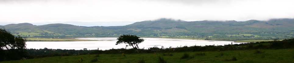
Scotland has a rich prehistory stretching from Neolithic times through the Bronze and Iron Ages. She has islands from the magnificent Orkneys and Shetlands to the Outer Hebrides and the Uists, the Isle of Skye and the Inner Hebrides. Each one is renowned for its ancient sanctity. Scotland was home to many different cultures including the Norse, Picts and Celts. She has a particularly unique and stunning landscape with holy mountains, spectacular lochs and sacred trees. The Highlands with their Pictish settlements and carved standing stones offer yet another kind of awe-inspiring beauty. Fairy folklore, poets and bards, Arthurian and Merlin related sites, Celtic Christian foundations and their Saints are all to be found in this land.
This guidebook not only takes the reader on an inspiring journey of discovery into Scotland’s past, but, also, offers directions to places regarded by Scots themselves of special importance, what they mean and their relevance today.
- Published : 03/11/2014
- ISBN : 9780906362761
- Format : Paperback
- Imprint : Gothic Image Publications
- Size (mm): 110 x 215
- Category: Travel
- Pages : 500
- Price £16.99
November 4, 2014 Comments Off on The Traveller’s Guide to Sacred Scotland
Poetry at Relay for Life
I love Shakespeare, but I’ve never really thought of performing any.
However when we were preparing for the Relay For Life of Second Life Telethon, several members of the team were invited to record a series of poems to be played during the Luminaria ceremony (one of the most moving parts of the event).
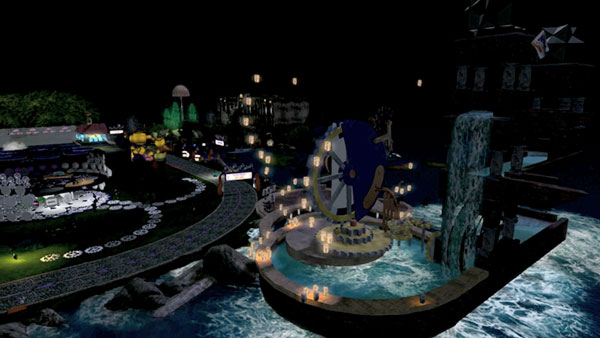
Lantern release during the Luminaria ceremony — image by Beq Janus
The Luminaria Ceremony occurs at every Relay For Life event, whether in the organic world, or as in our case, in a virtual world. As the sun sets, luminaria lining the track light up the night. A hush falls over the crowd that had been overflowing with celebration. Participants, survivors, and caregivers then gather to remember loved ones lost to cancer and to honour those whose fight continues. The ceremony in Second Life included a wonderful additional feature: the releasing of illuminated Chinese lanterns into the night sky (see Beq’s picture above, taken in front of her amazing Escher build that you can just make out).
The official commentary is carried by T1 Radio, and they read a list of names, between which they play pieces of music. Now, they have a licence to play commercial records, but we don’t, so this year they kindly gave us a running order and timings and we were able to determine what was to go in the slots occupied by music in their coverage, so we could “opt out” to our own audio programming. This was the purpose of the pre-recorded poems. Members of our team put these recordings together with production music (mainly by Kevin MacLeod, see credit below) to create a series of really beautiful sequences, which I will hopefully be able to link to for you shortly where they’ll have full credits — they’re being assembled into a series of short videos accompanied by images of this year’s campsites.
One of the two pieces I chose to record was this speech from Prospero in The Tempest:
Our revels now are ended. These our actors,
As I foretold you, were all spirits, and
Are melted into air, into thin air;
And, like the baseless fabric of this vision,
The cloud-capped towers, the gorgeous palaces,
The solemn temples, the great globe itself,
Yea, all which it inherit, shall dissolve;
And, like this insubstantial pageant faded,
Leave not a rack behind. We are such stuff
As dreams are made on, and our little life
Is rounded with a sleep. (IV.i.148–158)
In addition to sending the voice-only recording off to the guys for incorporating in the sequence, I found a piece of music [Virtutes Instrumenti, Composed and performed by Kevin MacLeod (incompetech.com) Licensed under Creative Commons: By Attribution 3.0 http://creativecommons.org/
August 1, 2013 Comments Off on Poetry at Relay for Life
What is authenticity?
My attention was drawn to a rather interesting article in the Washington Post late last year on the use of “historical” FX in the movie “Lincoln”. Spielberg actually tried very hard to capture “authentic” sound effects — Lincoln’s actual pocket watch ticking, the ring of the bell of the church he attended, and so on.
Quite a lot of the time, in my experience, recording actual sounds doesn’t give you as effective a result as faking it with something else, but with sounds like those mentioned in the article, you can see why it might be worth chasing the originals. Apart from the fact that people notice when details are wrong — the BBC used to get letters if they used the sound of the wrong vintage plane in a radio play, for example, and they probably still do — there’s an interesting philosophical dimension here, about what we mean by “authentic”.
In the days of phonographs and cylinders, it was common to make recordings of famous people making famous speeches and other spoken material. Very often these were not recorded by the actual person claimed. But the degree of “realism” — or may we say “authenticity” — was judged by how well the performer represented the original person, not by whether or not it was the original person making the recording.
Similarly, we can read reviews of Clément Ader’s historic stereo relays from the Paris Opera House to the World Expo in Paris in 1881 and be surprised that listeners found the experience of listening to a pair of early moving-coil telephone earpieces fed by carbon microphones down hundreds of metres of wire so realistic. Surely it was nothing like hi-fi as we know it.
Exactly what we mean by “authenticity” has certainly changed over the years. And there is a distinct difference between accuracy and experience. When I’m in the studio, I try to do my best to ensure that the listener at home or on the move hears as close as possible to what we heard in the control room when we played back the master mix and said “That’s the one”. Is this a reasonable thing to seek to achieve? Or should we be striving to give people the best experience, regardless of authenticity? I touched on this the other day referring to miming at the Presidential Inauguration: definitely a case of going for the best experience.
To me, you can apply the old slogan “The closest approach to the original sound” to any recording as long as you know what you mean by the “original sound”. In my opinion this is generally the master playback, not what it sounded like out in the studio. In the case of multitrack layered popular music this is obviously the case. But how about a recording of a string quartet? Are you trying to give people the audio experience they would hear in a concert hall (I say “the audio experience” because you would be missing all the non-audible cues), or are you trying to give them the experience you had when you signed off the master playback? Well, probably, the latter.
It would be worth pointing out that listening to concert-hall recordings is frequently not very much like being there, because you only hear the music. Even if you recorded the concert Ambisonically, captured the entire soundfield and played it back faultlessly, you would only have captured the audio of the event, not the experience. This being the case, what is often done is to make the recording more lively and exciting to make up for the non-audio aspects of the performance. Close mics, changes of dynamics, and other techniques do make the playback more involving. In my opinion there is nothing wrong with this as long as it’s not dishonestly presented. Once again, the original sound is what’s heard in the control-room, not in the concert-hall — and that’s what you should be wanting people to hear at home.
It’s all very well claiming to reference playback systems to the sound of actual musical instruments, but that begs all kinds of — generally unanswerable — questions about how you established the sound of the instruments in the first place. What was your reference? Where did you hear them? How far away were you? Who was playing what? What was heard in the studio on master playback, however, is a perfect reference: it’s what the production team thought was the best representation of every aspect of the music, the composer, the artist and the performance — and more. They regarded it as the best communication between all those factors and the person listening to the recording. And, in my opinion, it’s the only thing you can reasonably expect to try to recreate for the listener.
For a further consideration of the philosophical implications of “authenticity”, in the context of “Lincoln”, check out this blog post.
February 1, 2013 Comments Off on What is authenticity?
Changes at the top of the page
More or less since we moved this site from being a conventional static web site to a WordPress environment based around the Thesis meta-theme, the header image has been randomly selected: each time you visited the site, you would see a different image.
This is actually very easy to do — there is a tutorial here — and it’s worked well. However, the other day I thought it would be rather neat for the header to consist of essentially a slideshow of the available images, gently crossfading.
One of the neat things about WordPress is that there are a great many plugins out there, many of them free, which you can locate to do things like this. For the Radio Riel site, I used a plugin called the Smart Slideshow Widget, for example (it replaced a rather fiddly flash slideshow that I used on the old RR site). The widget appears in the left sidebar to display a continuous and randomly-rotating set of logos for the station’s sponsors. However, this system only provides a widget: you can’t use it for a header image.
Go and search WordPress plugins for slideshows and you will find a great many, but most of them are a lot cleverer than I wanted. I just wanted to be able to stuff a set of images in a folder and have them display for a set period and crossfade over a set time. I definitely wanted to avoid flash (if I didn’t, I already have the tools to create flash slideshows, but flash is… a pain). This left me essentially with Javascript as the way to do the crossfading, and JQuery (already running on this site) or one of the other libraries will do that and lots more.
Many of the slideshow systems used the standard WordPress media upload system, which again was rather more than I needed. I started to install one of them and noticed that it messed with the Featured Image feature of WordPress. This rather warned me off, as I am already messing with the Featured Image capability to get it to work with Thesis — I’m using WordPress Featured Image for Thesis Theme from Thesistut, and I didn’t want to mess that up. And anyway, it was more complicated than I needed.
I finally found what I was looking for in the form of Cimy Header Image Rotator from Marco Cimmino. The plugin gives you some useful display options, such as a “Ken Burns Effect” instead of a simple crossfade — that’s the rostrum camera effect used extensively by film-maker Ken Burns, notably in his landmark series The Civil War (and now apparently a requirement for any PBS documentary), where rather than simply display a static image, you gently zoom in on it. The plugin also lets you include a caption and a link — either for all the images or for each.
The plugin has an upload folder (and you can actually upload additional files right in the plugin, which was a bonus) and once you’ve defined the parameters you get a bit of code to copy and paste into the appropriate Thesis hook (if you’re using Thesis), in my case the hook after the header. I replaced the existing random static header code with the new piece and it worked straight away.
Of course I wanted to tweak it a bit. I needed to change the size and position of the header image panel a little, which was easy, and wanted to alter the way the captions were displayed. The default is a little black lozenge (aka a round-cornered box) at the centre bottom of the image with the text in white. I tried dropping the lozenge and using a CSS drop shadow in black behind the text to pop the caption out of the image, whether it was dark or light, but the drop shadow wasn’t strong enough to do the job on really pale backgrounds. Eventually I lowered the caption to just under the image and made it black.
More tricky (and unsolved currently), I wanted to move the caption to be ranged left rather than centred. Unfortunately, the caption is positioned with respect to the entire browser window, and I have the page centred in the window so if you enlarge the window you get more air around the page equally on either side. This is fine if the caption is centred, but if it isn’t, you can’t define the location of the caption relative to the image. I will sort this out another day. In the meantime, enjoy the pics.
October 19, 2012 Comments Off on Changes at the top of the page
A belated movie discovery
I wonder if any readers watched the fascinating BBC series The Secret History Of Our Streets a few months ago, which traced 150 years of social history of several London locations.
In the intro there was a view of a fascinating “dark Satanic mills” kind of city (see above), presented in a context in which you would imagine it was representing Victorian London. But if you look for a moment at the image, you’ll see at once that there was never a London quite like that.
In fact it was a brief clip from a movie called Franklyn — and believe it or not, I know about this movie solely because, intrigued by that introductory image, I captured the frame, stuck it into Google Image Search, and looked at what came up. Hence I came to this film four years after it came out.
Franklyn (not the world’s most inspired title, but it is actually quite important to the action) tells a very nicely detailed and intertwined tale of four characters and moves between modern London and a kind of neo-Steampunk-mediaeval analogue, “Meanwhile City”, in which all the inhabitants are obliged to have a religion of some sort. It’s a very noir, Steampunk, SF, psychological thriller. There’s a certain amount of violence, which I don’t go for in general but here it’s fairly essential to the story: that is probably what earned it a 15 certificate in the UK (and “R” in the US).
The film features gorgeous costumes and CGI, yet on a relatively small budget. Not only that, it’s a British film, with British funding too, written and directed by Gerald McMorrow. It was his first feature, and considering the complexity of the plot and the visual requirements of the story, he does extremely well IMO. Morrow wrote it himself, inspired by a short film of his, Thespian X.
The Meanwhile City segments are beautifully done, and that’s where the CGI is concentrated, of course. The budget was able to be relatively small by virtue of the fact that only around 20% of the movie requires top-level effects like city-building and recreation of busy streets with all manner of characters milling about. The detail in the parallel world is excellent, and the costumes are wonderful and wondrous.
Yes, there are faint echoes of other films here (notably V for Vendetta, some have suggested, but apart from a character in a mask and a London setting most of the time, that’s about the extent of the similarity).
Reviews at the time of release (2008) were mixed, but that just shows how reviewers have difficulty with sophisticated plot-lines: it worked fine for me, and although there were some details that weren’t quite understandable until you’d seen the film through, realising what those details meant afterwards was part of the appeal (I felt the same about Sixth Sense for example). And I do like a film where I can’t tell what’s going to happen or how it’s going to end.
Some criticised it for not developing the characters sufficiently, but in fact I wasn’t conscious of that. We learn about them gradually as the story evolves. We need to learn about them gradually, because the entire plot revolves around the confluence of the characters and giving us their back-stories up front would be ruinous. Like Sixth Sense, you do not want to know too much about this story beforehand (don’t watch the fascinating “Making of” extra on the DVD until after you’ve seen the film, for example).
Yes, there are some issues with this film, but they’re minor IMO and it’s definitely worth a look. Actually two looks, because once you know how it ends, you’ll find you can suddenly grasp some little subtleties throughout the film that perhaps passed you by. There are even some elements of humour that are surprisingly appropriate.
And look out for the impressive different use of colour and shooting approach for each character. Meanwhile City is all earthy tones, for example, with little or no blue. Scenes involving the character Sally are always warm and well-lit. Mr Esser senior is often seen in silhouette, in the middle distance, with cool colours tending towards the blue. And so on. You may also notice (well, you will now) that as the action shifts back and forth between the two worlds, each location in London has a corresponding location in Meanwhile City that echoes it visually or at least functionally.
Here’s the official trailer:
The movie also has a very effective soundtrack by talented composer Joby Talbot (Once Around the Sun, Hitchhiker’s Guide to the Galaxy, Divine Comedy, etc) with an impressive major thematic element.
Recommended.
September 21, 2012 Comments Off on A belated movie discovery
Pitfalls of Facebook Page Tabs
I recently had occasion to create a couple of Facebook Apps for a client, to be accessed from tabs under the main timeline image on a business page.
There are plenty of tutorials around on how to do this, but I found a couple of pitfalls that don’t seem to be mentioned in the writeups I’ve seen.
Facebook Page Tabs
One of the many things that has changed about Facebook recently is the way that tabs on Business Pages are handled — this happened from April this year.
To begin with, you can no longer set up a tab as a landing page so non-fans who arrive at the page see it automatically: tabs are simply listed with thumbnail images under the header image. And while the content was previously limited to 520px width, you can now choose 810px wide as an alternative.
I was creating the very simplest of Facebook Apps: ones that simply call what is essentially a web page that gets embedded in a Facebook page with the Facebook equivalent of an iframe. The basic tutorial on this provided by Facebook can be found here.
To do this, you log into Facebook as a Developer (https://developers.facebook.com) using your usual credentials. Just to right of centre in the blue Facebook strip at the top of the page you’ll see “Apps”. Click this link and it shows you any apps you have created previously and there’s a button top right called “Create New App”.
As described in the tutorials, you need to give your new app a Display Name that appears beneath it on the Page; a unique Namespace; and a support contact email address. Then from the pop-up menu “Category”, choose “Apps for Pages”. For this simple app, that’s all you need in the top section. The tricky bit is next.
Selecting how your app integrates with Facebook
You now select how your app integrates with Facebook. Selecting “Page Tab” is obvious. You give the Page Tab a name; and supply secure and non-secure URLs. These point at the web location where the HTML content you want to display inserted on the Facebook page can be found. Providing a secure URL (ie one accessed via https:) is mandatory. It doesn’t seem to matter if the two URLs point to the same place, but I would suggest it’s a lot easier if they can, and your server is set up to serve both secure and non-secure content.
It may not be obligatory, but it turns out to be simplest if the URLs point to a directory in which the desired content is the default page: in other words, call your page “index.html” or whatever your server is set up to serve as default, and put it in a directory, for example one named after the application. So you might have a URL like “http://myserver.com/facebook/welcome/” — in other words, the URL points at a directory. This is what you want to enter into the Page Tab URL slot: with the forward-slash on the end.
You don’t need to provide a page tab edit URL. What you probably will want to include is a 111 x 74px image to appear in the box under the header on the main Facebook Page.
In addition, select the width of the inserted HTML material. You can use the original 520px width or the new 810px. Remember that whichever you choose, the HTML will be displayed on a blank white page with a Facebook blue strip at the top and little else: it should work visually in this environment. It turns out that the width is not quite as straightforward as it appears, as will be seen below.
On the face of it, you’re now done as far as the Facebook side of the setup is concerned. Wrong. There is another step you need to take, and that is to click the check-mark next to “App on Facebook”. This asks you to enter Canvas URL and Secure Canvas URL. Enter exactly the same URLs as you used above. This step is not obvious (don’t you just need to select Page Tab? No.) but if you don’t do it, you will get an error 191 when you try to add the App to a page. I have not seen this documented anywhere: have you? And if you look up Error 191, you’ll find that absolutely everyone gets this error and that nobody has suggested that filling in the “App on Facebook” tab is the solution, or what should go in there.
Once the above has been completed, you can go off and create your mini-pages that will be stored at the URLs above and will be displayed in an iframe on the Facebook page when visitors click on your app tab.
You can create the HTML in your favourite editor: I use Dreamweaver, but you can even create it in the Post Editor in WordPress, then click the HTML tab in the Editor and copy the code out, save it in a file with the right name, and upload it to the server.
In my case I had a 520px-wide x 775px high image and I simply placed it centred on the page and created a local image map to allow me to make it clickable, with different parts of the image taking visitors to different URLs on the client’s main web site. The client’s format involves black backgrounds, and the image had this, so I set the page background colour to black too, just in case. This proved to be inadvisable.
Adding the App to a Page
Once the page content is in position on your server, you are essentially done, and you can go back to Facebook and enter the special URL that allows you to select which of the Pages you administer the App should be added to. Why this isn’t easier is beyond me. A button would have been nice. The URL is:
https://www.facebook.com/dialog/pagetab?app_id=YOUR_APP_ID&next=YOUR_URL
You get the App ID from the Settings page of your App, in the top section. The “Your URL” is the tricky bit. It’s the Canvas URL, and this is why it needs to be there. If it isn’t, then whatever you put in there, you’ll get the 191 error, which seems to relate to where the app redirects you to when you click on it.
All being well, though, you will get a nice little page that allows you to choose one of the pages you administer and add the App to the Page. You can then go to the Page and move the order of the tabs around to suit you (the “Photos” tab has to be first, for some reason, but you can move the others by swapping them around).
When 520px is actually 512
If you created the page the way I described above, with an image and imagemap, you will notice straight away that it hasn’t quite worked. The same is true if you sliced your image into bits, each with its own linked, and positioned them with a table. You will (probably, I assume it wasn’t just me) see horizontal and vertical scroll bars. WTF?
By simply reducing the width one pixel at a time I discovered that both scroll bars go away if you set the width to 512px. Nowhere have I seen this documented, so I would be fascinated to know under what circumstances this appears. So I trimmed the image a little so that it was 512px wide and lo! It worked!
And now you run into another little aesthetic issue. You’ll recall that I had my image on a black background. So I look at my image on the Facebook page and I notice a black strip down the left-hand side. It turns out that this strip is 8px wide. Hmmm. The image has to be 512 or it shows scroll bars, but it is placed in a 520px-wide space. Odd. Not only that, the image is ranged right in the space, even though the HTML centres it on the page. This appears to be the case whatever image positioning you use.
As a result, I had to remove the black background from the page, instead setting it to white, the background colour of the Facebook page. Nobody will notice that the image is 8px to the right.
June 15, 2012 Comments Off on Pitfalls of Facebook Page Tabs
Last Riot at Valle dei Templi
Situated near the SW Sicilian coast is the town of Agrigento, home of the so-called “Valley of the Temples” (Valle dei Templi), a ridge of land above the ancient city that is the site of a linear cluster of (mainly) Ancient Greek ruins, many of which are quite spectacular — the place is well worth a visit. It is a UNESCO World Heritage site.
In addition to the Greek and Byzantine remains, there is the Villa Aurea, which was home to 19th Century British military officer and archaeological patron Alexander Hardcastle, who financed, among other things, the re-erection of the pillars at the Temple of Heracles on the site.
Today, the Valle dei Templi is not simply a collection of ancient sites: it’s also a location for modern art which is distributed among the ruins and elsewhere, such as in the Villa.
Thus it was that on a recent visit I encountered this remarkable piece of statuary in the Villa Aurea garden, in brilliant, shiny white material showing a group of fashionably-dressed young people poised to kill one of their number with various weapons. What on Earth was this amazing piece of work? There was no indication on or near the piece to indicate its origin or significance.
After a surprisingly lengthy Internet search, I found the answer. It is a (small) part of a multimedia collection of works by the Moscow-based art group “AES+F” titled Last Riot/Last Riot 2.
AES+F are named after their initials: the group, founded in 1987, was originally AES — Tatiana Arzamasova, Lev Evzovich and Evgeny Svyatsky — but they were later joined by photographer Vladimir Fridkes — hence the “+F”.
Last Riot first appeared in 2007 at the Venice Biennial as a three-screen video providing windows into a highly detailed 3D virtual environment, inspired apparently by the US Army video game “America’s Army”, created to encourage young people to enlist. You can see excerpts from it here:
AES+F say about the work:
“The virtual world generated by the real world of the past twentieth century as the organism coming from a test-tube, expands, leaving its borders and grasping new zones, absorbs its founders and mutates in something absolutely new. In this new world the real wars look like a game on www.americasarmy.com, and prison tortures appear sadistic exercises of modern valkyrias. Technologies and materials transform the artificial environment and techniques into a fantasy landscape of the new epos. This paradise also is a mutated world with frozen time where all past epoch the neighbor with the future, where inhabitants lose their sex, and become closer to angels. The world, where any most severe, vague or erotic imagination is natural in the fake unsteady 3D perspective. The heroes of new epos have only one identity, the identity of the rebel of last riot. The last riot, where all are fighting against all and against themselves, where no difference exists any more between victim and aggressor, male and female. This world celebrates the end of ideology, history and ethic.”
In addition to the video, there are series of glossy white sculptures of which the example at the Villa is one, and remarkable still images featuring the same weaponised, brand-name-dressed young people, in a kind of superrealistic style that somehow echoes works of the Renaissance as much as they do CGI-created videogame characters.
Here’s the statue from the Villa in an art gallery setting (from the AES+F web site):

…and one of the images from the same source:

I would love to experience the original video as well as the other pieces, especially given my interest in virtual worlds. Kudos to the people who arrange the art exhibitions along the Valle dei Templi for introducing me — and many other people I hope — to the stunning work of a fascinating group of artists.
Visit the AES/AES+F web site
Last Riot on the AES+F web site
April 20, 2012 Comments Off on Last Riot at Valle dei Templi
Lumiere — A Festival of Light
Last weekend I was lucky enough to get up to Durham, in the NE of England, to spend a couple of nights experiencing the latest event from Artichoke, titled Lumiere. And a magnificent event it was too.
Lumiere was in fact how I first heard about Artichoke, via a TV documentary on Sky Arts (in the old days when I used to subscribe to Murdoch TV — we’re now on Freesat). That first Lumiere happened in 2009, and of course I’d missed it. But they planned to do it again, and when I heard about the 2011 event I was quick to block out the time and book a hotel.
The event, which brought dozens of international artists working with light into the heart of the mediaeval city, turning it into a vast illuminated art gallery, lasted over four nights, nominally from 6–11pm, and featured around three dozen separate exhibits. Some of the higher profile installations were in the city centre, but many were rather further out, and in fact you would have needed all four nights to catch everything. I only had two nights, and that simply wasn’t enough — I probably saw about 2/3 of the installations and missed some that I really wanted to see. Thankfully the weather was kind to us — no rain and in fact quite warm — a good deal warmer, in fact, than the last Artichoke event I attended, Dining with Alice, back in May!
What I had rather underestimated was the number of people who would throng the centre of the ancient city as night fell and we approached 6pm. We gathered next to the statue of the Marquess of Londonderry — not one of the nicest people in life, allegedly — who had been transformed, thanks to Jacques Rival, into an immense snow-globe with the words “I Love Durham” on the plinth. Hehe.

The crowd control was excellent, despite the enormous numbers of people, but what the organisers could have done that would have helped was to have had a fairly serious PA set up in the Market Place so that the crowds could be informed about what was happening. The bull horns in use had an effective range of about 10 feet, so most of the time none of us had any idea what was happening or going to happen. It turned out that we were waiting to be allowed up the cobble streets to the Cathedral, but we didn’t all know that. However, that is the only mildly negative comment I have about the whole festival, and hopefully the planned 2013 event will take this suggestion into account.
Via Twitter, @ArtichokeTrust asked what my favourite exhibit was, and it’s really difficult to say. Of course the amazing son et lumiere at the Cathedral, highlight of the original 2009 show, must rate up there, and that’s the first thing we were effectively queuing to see. Titled Crown of Light, it consisted of marvellous images of the Lindisfarne Gospels and much more, illuminating the front of the Cathedral with multiple sections sliding up and down independently, accompanied by a powerful surround audio and music soundtrack including actual environmental recordings from Lindisfarne itself (though I think it would have sounded better in Ambisonics, of course). Crown of Light was created by Ross Ashton, Robert Ziegler, and John Del’ Nero.
It’s actually quite hard to convey much of a sense of Crown of Light as it was so immense. But here’s a taste:

The above video includes two extracts, one from near the beginning and the other from the end. It’s a hand-held mini-camera running at its highest sensitivity, so it’s not wonderful quality, but hopefully you’ll get the idea. The first extract is 16:9 and the second pillarboxed 4:3, the latter showing rather more of the building.
Following the presentation (there were three per hour), we could either go off to the left, and down towards the river, or we could file into the Cathedral itself, where there were some amazing things going on in the Nave, the cloisters and the College gardens behind.
Compagnie Carabosse had hung the Nave with lamps made of white vests on frames, while at the far end of the Nave, next to the pulpit, was a gentleman performing on electric guitar, synth and vocals, in a rather cool neo-Steampunk environment. This photo of him is a bit ropey, but hopefully you get the idea from that and the (even more ropey) raw iPhone video below (the audio improves dramatically at 2:22).

In the cloisters and gardens it was fire — with amazing metal frameworks and sculptures with flames issuing from various parts — from the enormous (a rotating globe covered in firepots in the cloisters) to fiery fountains and strange little figures.


Emerging from the gardens through an ancient archway, we turned down the hill to be confronted by a sequence of marvellous illuminated wire-mesh sculptured human figures, sometimes flying, sometimes sitting nonchalantly on a roof, or reclining in a garden. These were Les Voyageurs (The Travellers), by Cedric Le Borgne — a number of French artists were represented here.
We proceeded down the hill, marvelling at these overhead, nearby and distant figures, until we came to Prebends Bridge, which gave us a passage through a progressive rainbow of colours.
And then it was back towards the centre of the city along the riverfront, with the trees and bridges illuminated by gently shifting coloured lights — and virtually all the lights in the Festival, incidentally, were low-energy varieties, with some City lighting turned off so the overall energy impact of the event was minimal.
Some of the exhibits were lower-key, but nonetheless effective. Real and imaginary stories were told in illuminated text; a clock on a far building spelled out the time in lower-case Helvetica; and a series of illuminated panels hung high above the narrow streets. Possibly the best-known artist’s work at Lumiere was Tracey Emin’s: an illuminated phrase, “Be Faithful to your dreams” in blue, handwriting-style text on the side of the chapel in a disused graveyard, approached along a path lined with trees softly shining with slowly shifting colours.
Elsewhere, an enormous light bulb made of lights hung over the river Wear:

…while commonly-thrown-away objects were montaged and lit with LEDs:

We had an invitation to join friends and sponsors in the Town Hall on the Saturday night, which was good fun, and I had some interesting chats — with Artichoke co-Director Nicky Webb and with the people who organised the food for Dining With Alice, who had quite a tale to tell, to name but two.
All in all, Lumiere 2011 was an amazing, magical, marvellous festival of lights and art – exactly what I have learned to expect from Artichoke. I do hope they are able to do it again in 2013.
For more videos of Lumiere (including some from the first event in 2009) on Vimeo, click here.
November 23, 2011 Comments Off on Lumiere — A Festival of Light
Christmas(ish) At Beamish
Whenever I’m in the NE of England, I try to get over to Beamish - “The Living Museum of the North”. It’s a wonderful place built around a road/tramway loop on which run vintage buses and trams.
On this occasion (20 November) I was up for the weekend to go to Lumiere in Durham, so nipping over was a chance I couldn’t miss. It was foggy on leaving Durham but approaching Beamish the sun came out and it was gorgeously sunny until the drive home, when the fog closed in again.
Different sites around the tramway loop recreate different eras, each created from buildings that have been lovingly transplanted from their original sites: the Town, for example, is Edwardian, with a Bank, a gorgeous Masonic Hall (rebuilt with the help of the Masons, apparently), a Co-Op department store, sweet shop/factory and lots more. It also has an adjacent Steam Railway and station and a steam-powered fairground.
The Pit Village is perhaps somewhat earlier, and features a colliery and a relatively new addition: a coal-fired fish & chip shop that uses beef dripping to cook with, resulting in utterly tasty meals that you have to queue for twenty minutes or so to get, it’s so popular. Yet another area, Pockerley, is more Georgian, with a Waggonway that features steam locos from the earliest times and Pockerley Old Hall. I’ve talked about Beamish before, here.

From this time of year until Christmas itself, Beamish is having a series of Christmas weekends, including Santa’s Grotto somewhere over by Pockerley I think, complete with snow, an ice-rink in the Colliery Village (above), and decorations up in the Town.
I had to pop into some of the terraced houses, several of which contain businesses, such as a solicitor’s and a dentist — the torture chamber itself is shown below. In those days you would have had the option of (unregulated) nitrous oxide (with a fair risk of death) or cocaine as anaesthetics, the latter effectively removing your short-term memory, so things hurt but you didn’t remember it (rather like intravenous Valium it would appear, which I always loved as an adjunct to dental operations).

Another house included period Christmas decorations in the front room.

Across the street is a little park, with a bandstand, and there was the Murton Colliery Band preparing to play some suitably seasonal music, which they proceeded to do beautifully.

Here’s some video of extracts from their programme:
The band was formed as the Murton Gospel Temperance Blue Ribbon Army Band in 1884, and players were requested to wear a blue ribbon on the second button of their waistcoats. They became Murton Colliery band in 1895. When the colliery closed, the band became self-supporting — and it still is today. They’re also one of the few remaining bands to continue to call itself a ‘Colliery Band’, and they still proudly march through the village during the Durham Miners Gala and Armistice Day. I don’t know about you, but brass band music and Christmas do seem to go together rather well.
![]() There was time for a good wander around and trips on some of the trams — including a 1930s enclosed double-decker Blackpool tram, which is technically a little late for their re-creations but very impressive — and I had some good chats with the tramway staff, noticing that they wore the archetypal “wheel and magnet” emblem of British Electric Traction (later to become the parent, surprisingly, of Rediffusion Television) on their caps. The shop at Beamish should sell those cap badges — I would have bought at least one.
There was time for a good wander around and trips on some of the trams — including a 1930s enclosed double-decker Blackpool tram, which is technically a little late for their re-creations but very impressive — and I had some good chats with the tramway staff, noticing that they wore the archetypal “wheel and magnet” emblem of British Electric Traction (later to become the parent, surprisingly, of Rediffusion Television) on their caps. The shop at Beamish should sell those cap badges — I would have bought at least one.
Finally it was time to head off on the 3+ hour home, and soon after getting back on the A1 the fog closed in, and it ended up taking a good deal longer than that. But it was a great day out.
November 23, 2011 Comments Off on Christmas(ish) At Beamish
75 Years of BBC Television
Wednesday 2nd November saw the 75th anniversary of the opening of the BBC Television Service.
To commemorate the event, the BBC held a special celebration at Alexandra Palace, where the Service opened.

Originally, the intention was to hold a special Open Day on the 2nd, at which members of the public would be able to visit the studios and see audio-visual presentations. However this was eventually moved to November 5–6, leaving only an internal BBC event happening on the actual day.
I managed to obtain an invitation, for which my thanks to the ebullient Robert Seatter, head of BBC History, and technology journalist Bill Thompson.
The invitation said “3:45 for 4pm” and as a result I found myself in the Alexandra Palace Tower end car park well in time for the off, giving some time to take in the views over the city, experience the continual wind and enjoy some dramatic skies over this “Palace of the People” located at the highest point in North London.

When the BBC decided on Ally Pally as the site for the new BBC Television Service in the wake of the Selsdon Report in 1936, the place was already decaying somewhat. It’s a process that has continued since BBC Television left here several decades ago, and although the team now fronting the Trust that runs the site today is incredibly, and impressively, enthusiastic and upbeat, there is no way it can be other than an uphill struggle in these austere times. But you can’t say they aren’t trying hard and I wish them every success.
The BBC still maintains active offices in the block under the mast. But instead of entering through the doors there, adjacent to the GLC blue commemorative plaque on the wall, we were motioned into an entrance along to the left, up a metal ramp and into what had originally been the Transmitter Hall. It may be noted that this was probably not the first, but possibly the last, time that anyone had the bright idea of placing a pair of powerful VHF transmitters and a pigging great set of transmitting antennae right next to a set of television studios full of sensitive equipment.
![]() Inside, the room had been decorated with panels against the walls, each carrying information and images of some aspect of Ally Pally TV history, and a free-standing photo display of historical images, mainly provided by the Alexandra Palace Television Society. A jazz quartet played suitable 1930s style music; servers glided among the assembled invitees dispensing water, orange juice or Prosecco.
Inside, the room had been decorated with panels against the walls, each carrying information and images of some aspect of Ally Pally TV history, and a free-standing photo display of historical images, mainly provided by the Alexandra Palace Television Society. A jazz quartet played suitable 1930s style music; servers glided among the assembled invitees dispensing water, orange juice or Prosecco.
We had the chance to mingle and chat, and I was very pleased to meet TV cook Zena Skinner, who probably coined the phrase “Here’s one I made earlier” — though in her case she really had made it earlier, herself; I also met Professor Jean Seaton, the BBC’s Official Historian and Professor of Media History at the University of Westminster; and talked briefly to John Trenouth, Technology Adviser to the BBC Collection, whom I met during his time at what is now the National Media Museum in Bradford.
In the centre of the room, a make-up table and lights were set up, where various young women were being made up using the colours required by the Baird System.

When the BBC Television Service was established, the Government required two television systems to be used. On the one hand was the all-electronic Marconi-EMI system, which offered 405 lines, and on the other was the Baird electromechanical system which delivered 240-line television. Early on, it became evident that the Marconi-EMI system was significantly superior, but it had been Baird who had tirelessly promoted television as a concept, and lobbied the GPO over licensing and the Government to legislate for a Television Service. Baird highlighted the fact that his was a British invention – though it could equally legitimately be claimed that the Marconi-EMI system was British. Almost certainly the Government decision, a typical British compromise, was made at least in part to avoid suggestions that they were turning down a British innovation, the decision mandating the use of both systems on an alternating basis for six months before a choice was to be made before the two. The problems experienced with the technological dead-end of the Baird mechanical scanning system resulted in the decision — in favour of Marconi-EMI — to be made after just three months.
Baird Television actually used two systems. The fundamental feature of both was a “flying spot scanner” in which, almost completely counter-intuitively, the scene was scanned with a spot of light and photocells collected the light reflected from the subject. The “Spotlight Studio” used nothing more than this; the Intermediate Film Technique used a conventional film camera, exposed film from which was then passed immediately through developer and highly poisonous cyanide-based fixer (particularly nasty when it got loose), then scanned with a a flying spot actually under water. The flying spot scanner was very sensitive to red light, so if you were appearing in the Spotlight Studio, you needed the special make up: black lipstick, blue eye-shadow and a pale white face. Very neo-Goth. You checked it by looking through a red gel.
This was the make-up that was being applied to the young ladies at Ally Pally on the 2nd. Apparently the idea had originally been that BBC London would be sending a crew up to cover the party, but they had pulled out and the job was left to an enthusiastic team from BBC News School Report.
Meanwhile, we were treated to welcoming presentations: by the PR gentleman from the AP team, and from Robert Seatter, who encouraged us to relinquish our glasses and proceed upstairs to Studio A.
There were two main studios at Ally Pally originally, one above the other. Studio A was the Marconi-EMI studio, while directly above it was the Baird studio, Studio B. You can’t go into B today, because it’s riddled with asbestos and things are likely to fall on your head. But Studio A is accessible. At one end of the room is a tableau representing the production of the magazine programme Picture Page, which ran from 1936–39 and 1946–52 and was initially presented by Joan Miller.

Around the room are assembled old TV sets, and various exhibits in the room itself included an EMItron camera, which John Trenouth of the National Media Museum in Bradford kindly removed the lid of so we could have a look at the innards (sans tube).
In Studio A we were treated to a couple of brief audio-visual presentations, the first assembled mainly from clips from the film documentary Television Comes To London, which was made to tell the BBC Television Service story in 1936. Rebecca Kane, the MD of Alexandra Palace Trading Ltd, introduced Michael Aspel, a newsreader at AP during the period when BBC Television News was based here, to cut the cake.

And what a cake it was: made in the form of an old bakelite television with a picture of Alexandra Palace on the screen, deliciously thick icing and succulent innards. Very nice.
After that, we all wandered around Studio A and chatted to each other. I got into an amusing discussion about the way in which the Television Service closed down at the start of the Second World War, on September 1st, 1939 – about which a number of myths have arisen, most of which are incorrect (including the perpetuation of the main myth in Alan Yentob’s Imagine documentary, re-shown on Wednesday) – see The Edit that Rewrote History on the Transdiffusion Baird site, which includes a number of articles on television prior to 1955.
And then we gradually sloped off home.
See also:
The birth of television: the “Baird” microsite at Transdiffusion
75 years on from BBC television’s technology battle — a nice piece by John Trenouth
BBC Celebrates 75 Years of TV — Nick Higham visits Alexandra Palace
November 5, 2011 Comments Off on 75 Years of BBC Television