Category — Art
The Traveller’s Guide to Sacred Scotland
We’re pleased to be able to tell you about the new book from our friend Marianna Lines. An authority on ancient sites, especially in Scotland where she lives, Marianna is also a talented artist. Her book is available now from all the usual places, including your local bookstore and those online people who don’t pay their taxes. The Traveller’s Guide to Sacred Scotland is published by Gothic Image in Glastonbury.
The Traveller’s Guide to Sacred Scotland
A Guide To Scotland’s Ancient Sites and Sacred Places
Marianna Lines
Buy from the publishers, Gothic Image
The first guidebook to weave together the cultural, historical and spiritual aspects of this fascinating country, it will enhance the experience of the armchair traveller as well as any pilgrim to the ancient magical land of Scotland.
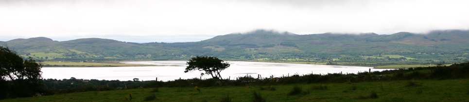
Scotland has a rich prehistory stretching from Neolithic times through the Bronze and Iron Ages. She has islands from the magnificent Orkneys and Shetlands to the Outer Hebrides and the Uists, the Isle of Skye and the Inner Hebrides. Each one is renowned for its ancient sanctity. Scotland was home to many different cultures including the Norse, Picts and Celts. She has a particularly unique and stunning landscape with holy mountains, spectacular lochs and sacred trees. The Highlands with their Pictish settlements and carved standing stones offer yet another kind of awe-inspiring beauty. Fairy folklore, poets and bards, Arthurian and Merlin related sites, Celtic Christian foundations and their Saints are all to be found in this land.
This guidebook not only takes the reader on an inspiring journey of discovery into Scotland’s past, but, also, offers directions to places regarded by Scots themselves of special importance, what they mean and their relevance today.
- Published : 03/11/2014
- ISBN : 9780906362761
- Format : Paperback
- Imprint : Gothic Image Publications
- Size (mm): 110 x 215
- Category: Travel
- Pages : 500
- Price £16.99
November 4, 2014 Comments Off on The Traveller’s Guide to Sacred Scotland
Poetry at Relay for Life
I love Shakespeare, but I’ve never really thought of performing any.
However when we were preparing for the Relay For Life of Second Life Telethon, several members of the team were invited to record a series of poems to be played during the Luminaria ceremony (one of the most moving parts of the event).
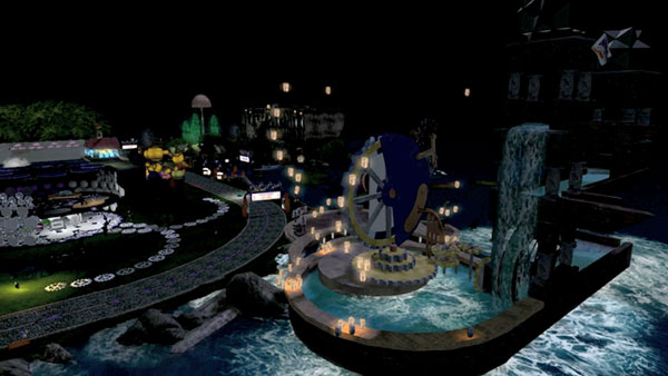
Lantern release during the Luminaria ceremony — image by Beq Janus
The Luminaria Ceremony occurs at every Relay For Life event, whether in the organic world, or as in our case, in a virtual world. As the sun sets, luminaria lining the track light up the night. A hush falls over the crowd that had been overflowing with celebration. Participants, survivors, and caregivers then gather to remember loved ones lost to cancer and to honour those whose fight continues. The ceremony in Second Life included a wonderful additional feature: the releasing of illuminated Chinese lanterns into the night sky (see Beq’s picture above, taken in front of her amazing Escher build that you can just make out).
The official commentary is carried by T1 Radio, and they read a list of names, between which they play pieces of music. Now, they have a licence to play commercial records, but we don’t, so this year they kindly gave us a running order and timings and we were able to determine what was to go in the slots occupied by music in their coverage, so we could “opt out” to our own audio programming. This was the purpose of the pre-recorded poems. Members of our team put these recordings together with production music (mainly by Kevin MacLeod, see credit below) to create a series of really beautiful sequences, which I will hopefully be able to link to for you shortly where they’ll have full credits — they’re being assembled into a series of short videos accompanied by images of this year’s campsites.
One of the two pieces I chose to record was this speech from Prospero in The Tempest:
Our revels now are ended. These our actors,
As I foretold you, were all spirits, and
Are melted into air, into thin air;
And, like the baseless fabric of this vision,
The cloud-capped towers, the gorgeous palaces,
The solemn temples, the great globe itself,
Yea, all which it inherit, shall dissolve;
And, like this insubstantial pageant faded,
Leave not a rack behind. We are such stuff
As dreams are made on, and our little life
Is rounded with a sleep. (IV.i.148–158)
In addition to sending the voice-only recording off to the guys for incorporating in the sequence, I found a piece of music [Virtutes Instrumenti, Composed and performed by Kevin MacLeod (incompetech.com) Licensed under Creative Commons: By Attribution 3.0 http://creativecommons.org/
August 1, 2013 Comments Off on Poetry at Relay for Life
A belated movie discovery
I wonder if any readers watched the fascinating BBC series The Secret History Of Our Streets a few months ago, which traced 150 years of social history of several London locations.
In the intro there was a view of a fascinating “dark Satanic mills” kind of city (see above), presented in a context in which you would imagine it was representing Victorian London. But if you look for a moment at the image, you’ll see at once that there was never a London quite like that.
In fact it was a brief clip from a movie called Franklyn — and believe it or not, I know about this movie solely because, intrigued by that introductory image, I captured the frame, stuck it into Google Image Search, and looked at what came up. Hence I came to this film four years after it came out.
Franklyn (not the world’s most inspired title, but it is actually quite important to the action) tells a very nicely detailed and intertwined tale of four characters and moves between modern London and a kind of neo-Steampunk-mediaeval analogue, “Meanwhile City”, in which all the inhabitants are obliged to have a religion of some sort. It’s a very noir, Steampunk, SF, psychological thriller. There’s a certain amount of violence, which I don’t go for in general but here it’s fairly essential to the story: that is probably what earned it a 15 certificate in the UK (and “R” in the US).
The film features gorgeous costumes and CGI, yet on a relatively small budget. Not only that, it’s a British film, with British funding too, written and directed by Gerald McMorrow. It was his first feature, and considering the complexity of the plot and the visual requirements of the story, he does extremely well IMO. Morrow wrote it himself, inspired by a short film of his, Thespian X.
The Meanwhile City segments are beautifully done, and that’s where the CGI is concentrated, of course. The budget was able to be relatively small by virtue of the fact that only around 20% of the movie requires top-level effects like city-building and recreation of busy streets with all manner of characters milling about. The detail in the parallel world is excellent, and the costumes are wonderful and wondrous.
Yes, there are faint echoes of other films here (notably V for Vendetta, some have suggested, but apart from a character in a mask and a London setting most of the time, that’s about the extent of the similarity).
Reviews at the time of release (2008) were mixed, but that just shows how reviewers have difficulty with sophisticated plot-lines: it worked fine for me, and although there were some details that weren’t quite understandable until you’d seen the film through, realising what those details meant afterwards was part of the appeal (I felt the same about Sixth Sense for example). And I do like a film where I can’t tell what’s going to happen or how it’s going to end.
Some criticised it for not developing the characters sufficiently, but in fact I wasn’t conscious of that. We learn about them gradually as the story evolves. We need to learn about them gradually, because the entire plot revolves around the confluence of the characters and giving us their back-stories up front would be ruinous. Like Sixth Sense, you do not want to know too much about this story beforehand (don’t watch the fascinating “Making of” extra on the DVD until after you’ve seen the film, for example).
Yes, there are some issues with this film, but they’re minor IMO and it’s definitely worth a look. Actually two looks, because once you know how it ends, you’ll find you can suddenly grasp some little subtleties throughout the film that perhaps passed you by. There are even some elements of humour that are surprisingly appropriate.
And look out for the impressive different use of colour and shooting approach for each character. Meanwhile City is all earthy tones, for example, with little or no blue. Scenes involving the character Sally are always warm and well-lit. Mr Esser senior is often seen in silhouette, in the middle distance, with cool colours tending towards the blue. And so on. You may also notice (well, you will now) that as the action shifts back and forth between the two worlds, each location in London has a corresponding location in Meanwhile City that echoes it visually or at least functionally.
Here’s the official trailer:
The movie also has a very effective soundtrack by talented composer Joby Talbot (Once Around the Sun, Hitchhiker’s Guide to the Galaxy, Divine Comedy, etc) with an impressive major thematic element.
Recommended.
September 21, 2012 Comments Off on A belated movie discovery
Last Riot at Valle dei Templi
Situated near the SW Sicilian coast is the town of Agrigento, home of the so-called “Valley of the Temples” (Valle dei Templi), a ridge of land above the ancient city that is the site of a linear cluster of (mainly) Ancient Greek ruins, many of which are quite spectacular — the place is well worth a visit. It is a UNESCO World Heritage site.
In addition to the Greek and Byzantine remains, there is the Villa Aurea, which was home to 19th Century British military officer and archaeological patron Alexander Hardcastle, who financed, among other things, the re-erection of the pillars at the Temple of Heracles on the site.
Today, the Valle dei Templi is not simply a collection of ancient sites: it’s also a location for modern art which is distributed among the ruins and elsewhere, such as in the Villa.
Thus it was that on a recent visit I encountered this remarkable piece of statuary in the Villa Aurea garden, in brilliant, shiny white material showing a group of fashionably-dressed young people poised to kill one of their number with various weapons. What on Earth was this amazing piece of work? There was no indication on or near the piece to indicate its origin or significance.
After a surprisingly lengthy Internet search, I found the answer. It is a (small) part of a multimedia collection of works by the Moscow-based art group “AES+F” titled Last Riot/Last Riot 2.
AES+F are named after their initials: the group, founded in 1987, was originally AES — Tatiana Arzamasova, Lev Evzovich and Evgeny Svyatsky — but they were later joined by photographer Vladimir Fridkes — hence the “+F”.
Last Riot first appeared in 2007 at the Venice Biennial as a three-screen video providing windows into a highly detailed 3D virtual environment, inspired apparently by the US Army video game “America’s Army”, created to encourage young people to enlist. You can see excerpts from it here:
AES+F say about the work:
“The virtual world generated by the real world of the past twentieth century as the organism coming from a test-tube, expands, leaving its borders and grasping new zones, absorbs its founders and mutates in something absolutely new. In this new world the real wars look like a game on www.americasarmy.com, and prison tortures appear sadistic exercises of modern valkyrias. Technologies and materials transform the artificial environment and techniques into a fantasy landscape of the new epos. This paradise also is a mutated world with frozen time where all past epoch the neighbor with the future, where inhabitants lose their sex, and become closer to angels. The world, where any most severe, vague or erotic imagination is natural in the fake unsteady 3D perspective. The heroes of new epos have only one identity, the identity of the rebel of last riot. The last riot, where all are fighting against all and against themselves, where no difference exists any more between victim and aggressor, male and female. This world celebrates the end of ideology, history and ethic.”
In addition to the video, there are series of glossy white sculptures of which the example at the Villa is one, and remarkable still images featuring the same weaponised, brand-name-dressed young people, in a kind of superrealistic style that somehow echoes works of the Renaissance as much as they do CGI-created videogame characters.
Here’s the statue from the Villa in an art gallery setting (from the AES+F web site):

…and one of the images from the same source:

I would love to experience the original video as well as the other pieces, especially given my interest in virtual worlds. Kudos to the people who arrange the art exhibitions along the Valle dei Templi for introducing me — and many other people I hope — to the stunning work of a fascinating group of artists.
Visit the AES/AES+F web site
Last Riot on the AES+F web site
April 20, 2012 Comments Off on Last Riot at Valle dei Templi
Lumiere — A Festival of Light
Last weekend I was lucky enough to get up to Durham, in the NE of England, to spend a couple of nights experiencing the latest event from Artichoke, titled Lumiere. And a magnificent event it was too.
Lumiere was in fact how I first heard about Artichoke, via a TV documentary on Sky Arts (in the old days when I used to subscribe to Murdoch TV — we’re now on Freesat). That first Lumiere happened in 2009, and of course I’d missed it. But they planned to do it again, and when I heard about the 2011 event I was quick to block out the time and book a hotel.
The event, which brought dozens of international artists working with light into the heart of the mediaeval city, turning it into a vast illuminated art gallery, lasted over four nights, nominally from 6–11pm, and featured around three dozen separate exhibits. Some of the higher profile installations were in the city centre, but many were rather further out, and in fact you would have needed all four nights to catch everything. I only had two nights, and that simply wasn’t enough — I probably saw about 2/3 of the installations and missed some that I really wanted to see. Thankfully the weather was kind to us — no rain and in fact quite warm — a good deal warmer, in fact, than the last Artichoke event I attended, Dining with Alice, back in May!
What I had rather underestimated was the number of people who would throng the centre of the ancient city as night fell and we approached 6pm. We gathered next to the statue of the Marquess of Londonderry — not one of the nicest people in life, allegedly — who had been transformed, thanks to Jacques Rival, into an immense snow-globe with the words “I Love Durham” on the plinth. Hehe.

The crowd control was excellent, despite the enormous numbers of people, but what the organisers could have done that would have helped was to have had a fairly serious PA set up in the Market Place so that the crowds could be informed about what was happening. The bull horns in use had an effective range of about 10 feet, so most of the time none of us had any idea what was happening or going to happen. It turned out that we were waiting to be allowed up the cobble streets to the Cathedral, but we didn’t all know that. However, that is the only mildly negative comment I have about the whole festival, and hopefully the planned 2013 event will take this suggestion into account.
Via Twitter, @ArtichokeTrust asked what my favourite exhibit was, and it’s really difficult to say. Of course the amazing son et lumiere at the Cathedral, highlight of the original 2009 show, must rate up there, and that’s the first thing we were effectively queuing to see. Titled Crown of Light, it consisted of marvellous images of the Lindisfarne Gospels and much more, illuminating the front of the Cathedral with multiple sections sliding up and down independently, accompanied by a powerful surround audio and music soundtrack including actual environmental recordings from Lindisfarne itself (though I think it would have sounded better in Ambisonics, of course). Crown of Light was created by Ross Ashton, Robert Ziegler, and John Del’ Nero.
It’s actually quite hard to convey much of a sense of Crown of Light as it was so immense. But here’s a taste:

The above video includes two extracts, one from near the beginning and the other from the end. It’s a hand-held mini-camera running at its highest sensitivity, so it’s not wonderful quality, but hopefully you’ll get the idea. The first extract is 16:9 and the second pillarboxed 4:3, the latter showing rather more of the building.
Following the presentation (there were three per hour), we could either go off to the left, and down towards the river, or we could file into the Cathedral itself, where there were some amazing things going on in the Nave, the cloisters and the College gardens behind.
Compagnie Carabosse had hung the Nave with lamps made of white vests on frames, while at the far end of the Nave, next to the pulpit, was a gentleman performing on electric guitar, synth and vocals, in a rather cool neo-Steampunk environment. This photo of him is a bit ropey, but hopefully you get the idea from that and the (even more ropey) raw iPhone video below (the audio improves dramatically at 2:22).

In the cloisters and gardens it was fire — with amazing metal frameworks and sculptures with flames issuing from various parts — from the enormous (a rotating globe covered in firepots in the cloisters) to fiery fountains and strange little figures.


Emerging from the gardens through an ancient archway, we turned down the hill to be confronted by a sequence of marvellous illuminated wire-mesh sculptured human figures, sometimes flying, sometimes sitting nonchalantly on a roof, or reclining in a garden. These were Les Voyageurs (The Travellers), by Cedric Le Borgne — a number of French artists were represented here.
We proceeded down the hill, marvelling at these overhead, nearby and distant figures, until we came to Prebends Bridge, which gave us a passage through a progressive rainbow of colours.
And then it was back towards the centre of the city along the riverfront, with the trees and bridges illuminated by gently shifting coloured lights — and virtually all the lights in the Festival, incidentally, were low-energy varieties, with some City lighting turned off so the overall energy impact of the event was minimal.
Some of the exhibits were lower-key, but nonetheless effective. Real and imaginary stories were told in illuminated text; a clock on a far building spelled out the time in lower-case Helvetica; and a series of illuminated panels hung high above the narrow streets. Possibly the best-known artist’s work at Lumiere was Tracey Emin’s: an illuminated phrase, “Be Faithful to your dreams” in blue, handwriting-style text on the side of the chapel in a disused graveyard, approached along a path lined with trees softly shining with slowly shifting colours.
Elsewhere, an enormous light bulb made of lights hung over the river Wear:

…while commonly-thrown-away objects were montaged and lit with LEDs:

We had an invitation to join friends and sponsors in the Town Hall on the Saturday night, which was good fun, and I had some interesting chats — with Artichoke co-Director Nicky Webb and with the people who organised the food for Dining With Alice, who had quite a tale to tell, to name but two.
All in all, Lumiere 2011 was an amazing, magical, marvellous festival of lights and art – exactly what I have learned to expect from Artichoke. I do hope they are able to do it again in 2013.
For more videos of Lumiere (including some from the first event in 2009) on Vimeo, click here.
November 23, 2011 Comments Off on Lumiere — A Festival of Light
“Hattie’s Map” Unveiled At Last
August 6th saw the unveiling of something rather special in our NW Cambridgeshire town of Somersham: a free-standing graphic panel in Church Street, somewhat mysteriously titled “Hattie’s Map”.
The Hattie in question is Hattie Skeggs, long-time resident and member of the Parish Council, who passed away recently. Her knowledge of the town and the original names and locations of places was legendary, and the Map commemorates her and the long history of the town.
The panel is double-sided: one side shows a map of footpaths around Somersham, provided by Cambridgeshire County Council, while the other depicts an aerial view of the Parish, for which I was very pleased to be invited to create the artwork. Indicated on it are around 50 places in and around the town, primarily of historical interest, along with some pictures of the centre of town and the Station area taken from old postcards, and a brief history of Somersham.
Putting it together has taken quite a long time, not least because of the difficulty in obtaining and licensing the aerial imagery around which I based the Map. When I was originally invited to create the panel, it wasn’t specified how it should be done, and I looked at a number of possibilities. The one that appealed to me most was the idea of showing the Parish from the air rather than simply drawing a map. I contacted numerous companies that offered aerial imagery with the appropriate licensing, and obtained quotes, some of which were within the kind of budget the Parish Council had in mind for the project. I did a mock-up using Google Earth imagery and presented it to the Council’s Working Group on the project, and they liked it and gave me the go-ahead to create the artwork.
Unfortunately, now having had the idea agreed, when I went back to the potential suppliers to order the mapping they had previously quoted me for, the prices were mysteriously now significantly higher, despite the fact that I had been meticulous in my specifications for the project. Some claimed they had updated their imagery since I had asked for the quote and the new imagery they were offering was much more detailed and better in every way – a privilege one had to pay for. Others simpy denied they’d provided the previous estimate or that it was only valid for a surprisingly short time or that the person I spoke to had got it wrong. One of the new figures was ten times the price I’d been quoted originally.
I continued to try one company after another as time ticked by, and continued to look for other sources – including the County Council, who had everything I needed but not the licences – but eventually I found one, GetMapping, towards the end of last year, which not only offered the resolution I needed but came in well within budget. They also had an exceptionally helpful staff member in the shape of Jake Lauder, who bent over backwards to get me what I needed. And when a little later we had to make some revisions due to boundary changes that extended the area for which I required imagery, they very kindly supplied a new, larger area file at no additional charge. Kudos to GetMapping and Jake in particular.

Click on the map above to see a larger version.
I worked on the project in several different graphics applications. I’d initially brought the rough Google imagery into Adobe Illustrator as a template and over that drawn and labelled the major roads and other features – like the course of the two railway lines that used to pass through Somersham. I also considered how to indicate the places of interest. I decided to go with numbered callouts in circles with a line pointing to the exact location.
It quickly became evident that building the entire A0 panel in Illustrator was going to become too unwieldy. It was fine with the low-resolution Google imagery, but the real hi-res file would be enormous and rather too big to scale, rotate and position precisely in Illustrator: it was so big that it would also slow the application down no end. As a result, I decided to build the panel in InDesign, and create the numbered callouts direct in the InDesign document on their own layer. This was also a much better idea for setting the text which, while not extensive, was much easier to manage in InDesign.
Helpfully, you can bring all kinds of files into InDesign with a great deal of flexibility – in particular if they come from another Creative Suite application. So I could import the Illustrator file in its own .ai format and turn different layers (such as the roads and labelling) on and off as required without having to re-export the image.
The Big Imagery File ultimately arrived and was surprisingly easy to bring into InDesign, size and rotate to the correct angle. To allow the imagery to be displayed as large as possible, I rotated the entire map so that the Parish ran from bottom left to top right. This put North at around 45 degrees. It also left a large area bottom right for a key to the Places of Interest and top left for the history of the town. Meanwhile along the bottom there was room for a pair of panels to include pictures of Old Somersham, kindly provided by the local Historical Society.

The Working Group determined the final list of locations. Some went back to the 18th century (and a couple back to Roman times), and while the obvious ones were easy to find, some were much more tricky. And I also came to find out a lot more about the history of the area and where some of the names came from. I was soon studying 1st Edition Ordnance Survey mapping, and earlier maps too: happily a lot is available on-line these days. I found the sites of old windmills; the origin of the name “The Pykle” (it dates back to around 1200 and means a field remnant: it is nothing to do with Parkhall Road formerly being called “Parkle Lane” – Parkle was a village to the North of town – and indeed, the name Parkhall had nothing to do with the Manor Hall that stood on that road); and the site of a weir used for cleaning cartwheels. I also discovered that nobody seemed to be able to agree on the exact location of the Special Operations Executive airstrip that was active during the Second World War. Evidently its secret was maintained. Fascinating.
Finally the map was finished and I was able to get my friends at local display graphics company Cameo in St Ives to run up some full-sized proofs: the final result was approved and I gave the Parish Council a hi-res PDF for the panel manufacturers to work from. We suffered a bit of a delay as the County had to come up with their own footpath map artwork, but eventually it was supplied and the project went into its production phase. Ultimately the panel was delivered and a date was set for its installation.
Sadly, during that time, Hattie herself passed away. The map was erected on Friday 5th by Michael Murray, who kindly provided these photographs, and it was unveiled officially on Saturday 6th August 2011, representing a fitting tribute to Hattie and recognising her love and good works for the town and people of Somersham. Here’s a video of the unveiling, and you can read more about it here.
August 8, 2011 Comments Off on “Hattie’s Map” Unveiled At Last
Peripatetic Dining with Alice

I first heard about the brilliant people at Artichoke Trust through seeing the TV coverage of their 2009 Lumiere event in Durham (and apparently there’s another one later this year).
Artichoke describe themselves as “a creative company that works with artists to invade our public spaces and put on extraordinary and ambitious events that live in the memory forever”, and based on their latest event (“extravaganza” in fact is not too strong a word), Dining with Alice, which runs until 21st May 2011, they have succeeded in that goal once again. If you’re reading this before the end of the run, do try and get tickets if you can – but be sure to wrap up warmly if you attend.
 Dining with Alice is presented as part of the Norfolk & Norwich Festival, around the gorgeous 15th century private house Elsing Hall in Norfolk (see view of the North Front, left). Artichoke have taken over the extensive and almost labyrinthine gardens and turned them into a wonderland of theatrical experiences and al fresco dining. As to the concept, Director Hilary Westlake suggests that the event is the answer to the question, “Just what happened to all the character’s in Alice’s adventures when they were no longer needed in her dreams?” It’s in fact a re-staging of an event originally created for the Salisbury Festival in 1999, when it was commissioned by now-Artichoke co-director Helen Marriage when she was the Festival’s director.
Peripatetic dining, inspired both by the seating arrangements at the Mad Hatter’s Tea Party (where you keep moving round the seats at the table) and by Lewis Carroll’s interest in mathematics, is at the heart of Dining with Alice, which is punctuated (and concluded) by a series of amusing theatrical presentations from a small cast of around 10 “Hosts” – in the form of the familiar White and Red Queens, the Queen (and King) of Hearts, the Duchess, the White Knight, the White Rabbit, the Mad Hatter, Tweedledum & Dee, butler Mr Alastair, and no less than half-a-dozen Alices – including “Alice After Wonderland”, “Alice in Wonderland”, a Tall Alice and some Tiny Alices. Plus a host of others, notably the “Turban Team”, about whom, more in a moment. Most, if not all the performers are from the East of England. The food is provided by Bompas and Parr with the aid of City College Norwich.
To begin with, you walk into and through the immaculate gardens via a circuitous route to find a marquee, with crisps and Victorian accompaniments, Hendrick’s Gin and a live string quartet, and have a wander around, talk to people – I was lucky enough to have a brief chat with Artichoke co-director Nicky Webb, whom I met originally in the Cambridge Picture House bar thanks to Bill Thompson – read the fascinating programme and find your name on the curiously-named “Seating Plan”. I say “curiously”, because there is, in fact, no indication where you’ll be sitting. Instead, there’s a colour and a number – and you notice that your colour/number combination is different from those of anyone you arrived with. Hmmm. After the guests have all arrived, the main characters march in to the accompaniment of a brass band and the first part of the event begins.
It turns out that the colour and number identify the waiter (“server” is not the right word, as they don’t serve the food) who will lead you, personally, to your places during the course of the evening: the former indicating the colour of their turban and the latter a number the member of the “Turban Team” holds and announces. You are separated from anyone else in your party as you go off, following your waiter on a circuitous route through the darkening gardens, while the sounds of Wonderland are heard around you in the forms of the calls of strange birds and creatures echoing across the lawns and emerging suddenly from nearby bushes. You have a chance to get to know the others who have the same colour and number as yourself – I was lucky enough to find myself in the company of three women with whom I had the opportunity to chat on our walk, before being separated as we were shown our tables for the first course. The main characters flit among the tables as you eat, engaging in conversations or not, until your waiter collects you for a further intricate walk to the next course. The tables are littered with strange things: little cards with riddles, labels, and other paraphernalia. You are indeed led into a kind of Wonderland, with a marvellous fantastic atmosphere unlike anything you’ve previously experienced.
 The evening was a series totalling six courses of excellent food, each taken at a different table, and after the first course, with one or more different people previously unknown to me – a truly wonderful idea and I’m pleased to have enjoyed several excellent discussions over dinner. Soon you find yourself in the company of the rest of your party, among others, and ultimately you’re led to a dining area that’s laid out almost like a conventional restaurant – except that it’s under the sky, and in front of you is a stage and live musicians before the South Front of the beautifully illuminated Elsing Hall (see main photo) – for the dessert and finale (above). The dining area was actually built out over the moat.
There’s a certain amount of walking involved, of which you should be aware (apparently arrangements can be made if your mobility is limited, but I don’t know the details) and the night we were there, the temperature dropped to around 6º Celsius, so do wrap up well. But do be sure not to miss this marvellous event. Congratulations to Artichoke and the whole team involved for a quite remarkable and unmissable experience. Definitely the best event I’ve attended for some time.

May 15, 2011 Comments Off on Peripatetic Dining with Alice
A sad day for virtual Frank Lloyd Wright fans
The Frank Lloyd Wright Virtual Museum in Second Life is widely regarded not only as a wonderful revivification of the legacy of America’s greatest architect, but as one of the major points of interest in Second Life and one held in high regard by architects and those of an artistic bent, many of whom are drawn to virtual worlds.
The FLWVM contains fascinating exhibits on the life and works of Frank Lloyd Wright, 3D virtual reconstructions of his key buildings, and much more, and it’s hosted by knowledgeable and helpful staff. For the last year or so there has been a licensing agreement in place between FLWVM and the Frank Lloyd Wright Foundation, the organisation that controls Frank Lloyd Wright’s legacy.
One of the Foundation’s goals is to “Preserve the works, ideas, and innovative spirit of Frank Lloyd Wright for the benefit of all generations” – one of the things that the FLWVM definitely does. I was very much saddened and surprised at the decision announced recently, therefore, by the Foundation not only to terminate its licensing agreement with Virtual Museums, Inc, who run the FLWVM, but also to issue a Cease and Desist order effectively requiring them to close forthwith. The Virtual Museum will therefore close on December 10 unless something happens to change that.
You can read more about the story surrounding this decision here in Prim Perfect Magazine’s blog, and the letter sent to supporters of the FLWVM by the Chair of Virtual Museums, Inc, Ethan Westland.
As a result of that decision, I was moved to write the following email to the Foundation via their contact email address, info[at]franklloydwright.org. If you agree with me, you might want to do the same.
I was saddened to hear today of the imminent closure of the Frank Lloyd Wright Virtual Museum in the virtual world of Second Life as a result of your Foundation withdrawing its existing licensing agreement with Virtual Museums Inc and apparent decision not to renew it.
I was involved in a TV programme about the virtual museum some months ago and was exceptionally impressed at the work they have been doing promoting the work and legacy of America’s greatest architect in new areas of technology. It seemed to me at the time (the show went out just as the original licensing agreement was being signed) that the licensing arrangement was a perfect idea in that it enabled the Foundation’s work and goals, and an awareness of the work of this great man, to be extended into new realms with health and vigour.
I am thus extremely disappointed that the Foundation has decided to take the measures, not only of failing to renegotiate the licensing agreement or some other mutually beneficial agreement allowing the Virtual Museum to continue, but with the additional step of issuing a Cease and Desist order effectively causing the Museum to close immediately.
From what I have heard about this decision, it appears to me that the Foundation has been labouring under the misunderstanding that as a result of the licensing agreement, the FLWVM somehow assumed responsibility not only for its own creations based on copyright designs and content owned by the Foundation, but also those of completely unconnected third parties. I note this as a result of the fact that the Cease and Desist order was apparently sent to the Virtual Museum and not to Linden Lab, the creators of Second Life; nor did it take the form of a DMCA take-down order addressed to Linden Lab – the usual course of action in the case of perceived copyright infringements in the virtual world.
I would strongly urge the Foundation to reconsider its action in this case and consider instead re-opening negotiations with Virtual Museums Inc with a view to reaching a further mutually-beneficial licensing arrangement that would allow the Frank Lloyd Wright Virtual Museum – widely regarded as a prime example of the great possibilities of virtual worlds in promoting art, culture and design – to continue operating, contributing so effectively as it does to the legacy of this great man.
If you’re a Second Life resident and you want to visit the Museum before it closes on 10 December, this link will teleport you there.
December 3, 2010 Comments Off on A sad day for virtual Frank Lloyd Wright fans
Setting basic poetry in WordPress
It would appear that one thing that WordPress isn’t naturally good at is setting poetry. The default WordPress action is that hitting Return inserts a line break, which is fine for prose articles but not for poetry, where you want a bunch of lines with hard returns but no space between them.
Leona has this problem all the time in the Poesie section of her own site, The Great Returning. One of her problems, of course, is that she writes in Microsoft Word, and the great temptation is to simply copy and paste the result into WordPress. This is probably the worst of all possible worlds, as Word is notorious for bringing all manner of HTML crap along with it that screws up virtually any web site formatting.
If you’re writing direct into WordPress, the solution is generally straightforward (subject to weirdnesses caused by your choice of theme): for blank lines between stanzas, hit Return; for simple line-breaks, use Shift-Return – they’re essentially the equivalents of “</p>” and “<br />” in HTML respectively. But who would write poetry direct into WordPress? I’m not sure, but most poets I know tweak their copy a good deal more than many journalists and probably need something a bit more like a word-processor to be confident of doing what they require. Certainly the default WordPress edit window doesn’t show enough lines for proper context — you probably want to see the entire opus while you’re writing. Do remember though, that in Settings->Writing you can adjust the number of lines visible in the window.
My personal preference when writing for the Web – whatever the content, by and large – outside the web application itself is to use the simplest of text editors (my favourite is TextWrangler from Bare Bones — but you can equally use TextEdit on a Macintosh or Notepad in Windows: basically the simplest text editor you have) and then copy and paste that.
If you are starting from Word, then copy the text out of Word and paste it into the text editor (thus stripping any Word nonsense formatting, but note you will also lose all the text styling too).
Then fix the copy as required so it looks decent (bear in mind you can’t style it, with italics etc yet), copy it out of the text editor and paste it into a new post in WordPress.
But. Before you paste…
Don’t paste it into the “Visual” Edit window – that will add some more formatting that will screw things up again (you’ll lose all the line-breaks). Instead, click the HTML tab at the top of the edit window, make sure the window is utterly blank, and paste it there. Then go back to the Visual tab and it should look fine. That done, you need to go through the poem and style any text that needs it, adding italics, bold and so on as required.
Even with all the formatting information stripped off the text before you bring it in, there may still be some variation in the resulting look due to the Theme you’re using. We’re using Thesis and this doesn’t seem to give much trouble. Your mileage may vary.
The above is fine for basic poetry. When it comes to special formatting, starting lines in odd places and creating shapes out of the text, I think I would probably consider setting it in Word (or whatever) and then taking a screen shot of it and inserting it as a graphic — which is a dreadful workaround, frankly. There must be a better way. Anyone got some better ideas?
August 12, 2010 Comments Off on Setting basic poetry in WordPress
Ballet mécanique in Cambridge
On Sunday last I had the almost unique opportunity to attend a performance of George Antheil’s Ballet mécanique at the West Road Concert Hall in Cambridge, part of the Cambridge Music Festival. The concert also marked the 100th anniversary year of the publication of the Futurist Manifesto.
My attention was drawn to the event by my friend Paul Lehrman, whom I knew originally as a brilliant journalist who used to write for me when I was Editor of Studio Sound back in the 1980s. Since then we’ve done a bunch of stuff together including music for KPM Music Library and much more.
Today, Paul is a music professor based at a university in the Boston area, and he has made quite a name for himself for his realisation of a version of Antheil’s work which calls (at least in its full version) for a percussion orchestra of three xylophones, four bass drums and a tam-tam (gong); two live pianists; seven or so electric bells; a siren; three aeroplane propellers; and 16 synchronized player pianos. As you can imagine, it’s a flamboyant, controversial, downright noisy piece of avant-garde music.
This large-scale version of the piece, composed around 1923, was never performed in Antheil’s lifetime, apparently because the friend of Antheil’s who told him you could sync up 16 player pianos was wrong: the technology of the time did not allow it. Paul Lehrman, however, was commissioned by music publishers G. Schirmer to realise the work for the 16 player pianos called for in the original manuscript, using modern digital technology in the form of digital player pianos, MIDI, and samples for the aircraft propellers.
This he did, and the first performance took place at the University of Massachusetts, Lowell, exactly ten years ago (on 18 November, 1999). Since then it’s been performed on numerous occasions around the world. You can read more about it, and about Antheil, at Paul’s site which you can find here at antheil.org.

Cambridge: rattles, pianos, Pianola and electric bells
This was not the version performed at West Road on Sunday, however. That was a somewhat more restrained version performed on this occasion on a single Pianola plus two live pianists, three xylophones, drums and percussion, rattles (performing the propeller parts), two electric doorbells and a hard-cranked siren. Musically, it was a version first performed in 1927 (and not very often thereafter). Paul asked me if I could go along and interview Paul Jackson, the conductor, experience the performance and find the answers to some questions about this particular version.
This sounded as if it could be enormous fun (which indeed it was) so I duly turned up for the event, Music hard and beautiful as a diamond, part of the 2009 Cambridge Music Festival, consisting of three works performed by Rex Lawson on Pianola, Julio d’Escriván on iPhone, the Anglia Sinfonia, Anglia Voices and MEME, conducted by Paul Jackson.

Pianola mechanism with roll
The concert itself was preceded by a 45-minute presentation by Lawson and d’Escriván about the Pianola and the iPhone as an instrument respectively (d’Escriván’s piece started the evening). I was particularly interested in Lawson’s exposition on the Pianola.
The Pianola is quite different from the Reproducing Piano and is not even truly the stuff of “player pianos” in saloons in cowboy movies, though they all use a “piano roll” to provide the notes. In the case of the Reproducing Piano, the roll contains not only the notes but all the tempo, expression and other aspects of an actual performance. Thus the big selling point of these systems, therefore, was to get famous performers and composers to perform their works, which could then be flawlessly reproduced at home.

Actuators in position over the Steinway keyboard
The Pianola, on the other hand, began life as a “cabinet player” – a box on castors that you wheel up to a conventional piano (a Steinway grand in the case of the Sunday performance) and lock into place so that its felt-covered actuators can press the keys. It’s powered by pedals, which drive the roll and also force air through the holes in the roll to sound the notes. By changing the pressure on the pedals (eg by stamping on them) you can also change the loudness of the notes – in other words, give the performance dynamics – that can be applied to different parts of the range. There’s also a tempo slider – and even technology that picks out the top line automatically.
This is all rather important, because the piano roll for a Pianola contains only the notes – the player determines the tempo and expression (in a solo performance, for example, including visual cues printed or written on the roll). Thus a Pianola performance actually is a performance, and not a playback. Yes, the notes are provided, but the expression is manually applied.
Pianola rolls were not created by playing the instrument and recording what the performer did, as in the case of the Reproducing Piano. Instead, they were created simply from the score. Imagine a MIDI sequence created in step-time with no velocity information and you get the idea.
Most people couldn’t be bothered to learn the subtle nuances of Pianola performance, however, and simply pedalled away, giving the instruments a rather lifeless, mechanical reputation which was entirely undeserved. Ultimately, mechanisms were built into (usually upright) pianos – and hence the player pianos in the bars depicted in the cowboy movies aforementioned.

The drum section and Paul Jackson, Conductor
Rex Lawson, who performed the Pianola part in Sunday’s concert, is a leading expert on the instrument, and his presentation disposed of quite a few myths, especially when it came to the performance of Ballet mécanique. The fact that the player controls the tempo means that the Pianola can actually follow a conductor in the conventional way – the Pianola does not have to set the tempo and have every other player sync to it. In Paul Lehrman’s performances, in contrast, the MIDI replay system that drives the player pianos also generates a click track that everyone follows.
Similarly, the fact that you can control the dynamics of the Pianola means that the instrument does not simply bash out all the notes at full blast. As a result, primarily, of these two factors, Ballet mécanique takes on a whole new degree of light and shade. Yes, it’s still a cacophony of 20s avant-garde exuberance, but it takes on a good deal of additional subtlety.
Lawson feels that the piece is designed to be played on these Edwardian instruments rather than modern digital systems, and that you need to actually perform the Pianola part – as he puts it, you need to “sweat”. However, he is interested in getting some fellow Pianola-owning friends together to perform the work on four Pianolas synchronised as far as tempo is concerned.
Lawson thinks the idea of 16 player pianos was Antheil showing off, that it was probably originally intended for four live pianists, and that the big problem with performing it at the time was that there were not nearly enough players in Paris who knew the subtleties of the Pianola and how to use its tempo and expression capabilities. In his planned 4‑Pianola performance, he would set the tempo at his Pianola and the others would follow the tempo he set by using stepper motors to sync them to his unit. Which sounds like a great idea, though there might be issues due to stretching or slippage of the rolls: it might need sprocketed piano rolls, which did actually exist.

The boxes for the three pianola rolls
The Sunday performance of the single-Pianola version used three piano rolls, and to allow changing them the performance was split into three movements.
The performance, for me, shed new light on a fascinating composition from the 1920s. A radically different interpretation from Paul Lehrman’s, it suggests interesting possibilities for a Lawson/Lehrman collaboration.
• The programme also included Grand Pianola Music by John Adams (no Pianolas involved), and Julio d’Escriván’s ingenious and expressive Ayayay! Concerto for iPhone, Pianola and orchestra.
November 25, 2009 Comments Off on Ballet mécanique in Cambridge